
The blog · Demand Generation · From The Demand Compass · 7 min
What is a good cold email reply rate?
Our own deployment numbers by channel, from cold to aware to in motion, and why the audience and the timing move the rate ten times more than the copy.

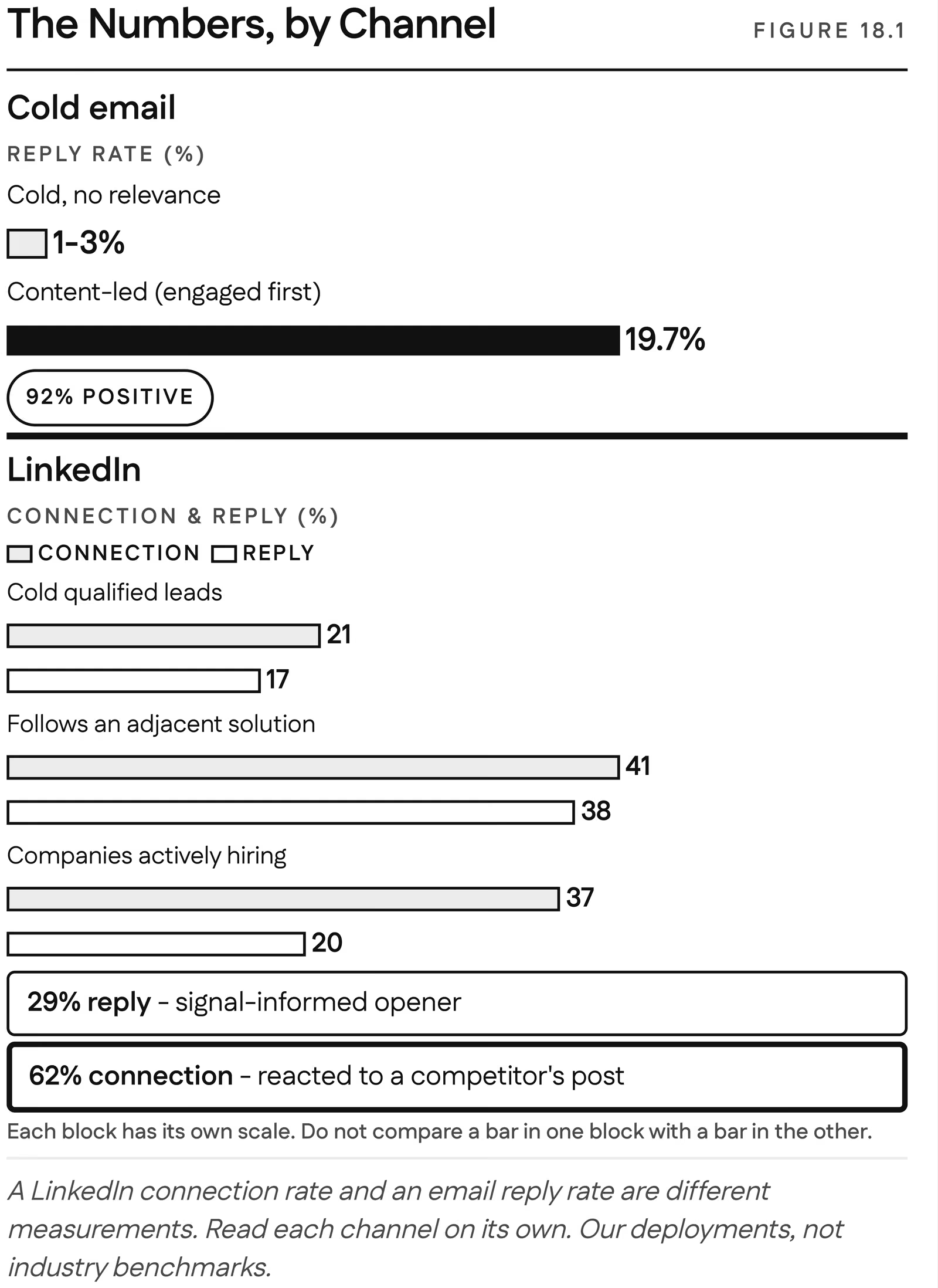
A cold email with no relevance behind it replies at one to three percent. The same channel, aimed at people who already recognized us because they had engaged with our content first, replied at almost twenty percent, with more than nine in ten of those replies positive. Signal-triggered outreach goes further still: in one deployment, a well-timed invitation to security leaders whose accounts were visibly in motion pulled interest at 67 percent, while generic outreach into the same market returned zero. The copy barely changed across those tiers; what changed was who we wrote to and when.
Why should reply rates be read one channel at a time?
Before any number, a rule: never mix channels in the same column. A LinkedIn connection acceptance and an email reply are different measurements, and blending them is how a deck starts lying. When someone quotes a "response rate", ask which channel, which denominator, and how much the audience already knew about them before the first message landed. Almost nobody asks the third question, and it explains most of the variance.
What follows are our numbers and our clients', from the markets we work in. They are not benchmarks or laws, just the shape of what happens when the system works. We publish the cohorts that came back zero alongside the ones that did well, because a number that tells you what to stop doing is worth more than one that flatters you.
What are the cold email reply rates by audience?
On cold email, a send with no relevance behind it replies at one to three percent. That is the floor, and most outbound lives there.
We ran that same channel into an audience that had engaged with our content first, people who already recognized our names. It replied at almost twenty percent, and more than nine in ten of those replies were positive. Same channel, barely different copy, close to ten times the result. Nothing about the sequence was cleverer. The recipients simply knew who was writing.
The third tier is outreach into motion: an account where signals show something is actually happening, a new leader, a hiring spike, a tooling change, reached while the signal is still fresh. That is where the 67 percent came from, and it is the tier where the contrast with cold becomes absurd, because the same market hit with generic outreach at the same time produced nothing at all.
Sit with how large those gaps are. Within one channel you can multiply your response several times over without writing a better email. What changes is who you reach and what they already know, and it compounds: several signals on one account tell you it is unmistakably in motion, and outreach into motion performs at a level cold outreach never touches.
Within one channel you can multiply your response several times over without writing a better email.
What are the LinkedIn connection and reply rates?
The LinkedIn baseline is higher than email, and the lift has the same shape. A cold connection request to qualified leads gets accepted around 21 percent of the time and replied to around 17 percent.
Aim the same outreach at a warmer audience and both rates jump:
- People who follow an adjacent solution accepted at 41 percent and replied at 38.
- An opener personalized to the problem behind a signal pulled replies near 30 percent.
- Companies actively hiring for the problem we solve replied at 20 percent against a connection rate in the high thirties.
- People who had just reacted to a competitor's posts, an audience both aware and in motion, accepted connections at 62 percent.
Notice the ordering. The audiences that combined awareness and motion outperformed the ones that had only one of the two, and both beat cold. That is the Demand Compass showing up in a spreadsheet: the reply rate climbs as an account moves up either axis, fastest when it moves up both.
What did three deployments teach us about reply rates?
Arrive when the signal is fresh. A non-human identity platform sold a technical product to security leaders, the buyer generic outbound never reaches. What moved the quarter was timing, not volume: reaching the accounts a signal showed were in motion, inside that window. The relevant, well-timed invitation pulled interest at 67 percent while generic outreach returned zero. Fourteen buyer-grade conversations opened in ninety days, one of them a security leader answering, "I'm evaluating solutions now and it fits." You do not earn that reply with more sends.
A small team has to choose. An AI trust and safety platform arrived with a database that looked full and was empty: 56,000 of its 59,000 contacts had no activity at all, and a team far too small to work them. Scoring the market on awareness and readiness turned that list into a queue of 51 accounts worth a rep's Monday, 45 of them matching the exact enterprise buyer the company sells to. A small team that works the right 51 beats the same team chasing thousands with no north.
Most of it is noise. An infrastructure software company was being evaluated in code repositories and technical forums where no form is ever filled out. The system earned its keep by subtraction: of 829 signals captured, it delivered 150 and discarded 82 percent before anyone saw them. Forwarding everything would only have moved the noise.
Why does the audience move reply rate more than the copy?
Our own numbers are not the only place the ground is moving. Dreamdata's 2026 benchmark, built on 66 million sessions across 3.5 million complete B2B journeys, found the average journey now runs 272 days and that 81 percent of it happens before a prospect reaches the sales pipeline. Source: Dreamdata, LinkedIn Ads Benchmarks Report, 2026
A cold email is one touch landing somewhere inside a nine-month journey, and whether it gets answered depends far more on where the account is in that journey than on the subject line. Copy still matters, but it is the last few percent, not the first ten times. If your team is A/B testing openers on a list with no signal behind it, you are polishing the doorknob on a house nobody is walking toward.
What should you measure after the reply?
Reply rate tells you whether the first message earned a response. It says almost nothing about whether you built a pipeline, and a skeptical CMO is right to push past it. These are composite ranges from our deployments; every one moves with your market.
- Pipeline influence. Accounts that engaged with the brand before an opportunity opened convert to qualified pipeline at roughly twice the rate of cold accounts in the same segment.
- Sales acceptance. A bare MQL gets worked maybe a third to half the time before reps learn to ignore the queue. An auditable, signal-led score, where the rep can see why the account surfaced, is frequently accepted north of 70 to 80 percent once the team has watched it pay off.
- Meeting-to-opportunity. Signal-led meetings become real opportunities at a higher rate than meetings forced through persistence, from a handful of points to maybe double, depending on how clean the signals are.
- Cycle speed. Deals where the brand did its work first and we acted inside the window have run roughly 25 to 30 percent faster than the cold-sourced equivalent.
- False positives. Some share of what the model flags as hot is noise, and the honest target is not zero. Zero false positives means the threshold is so high you are missing most of the real windows too.
At the system level the pattern is a multiple on pipeline from the same headcount, often four to five times, plus hours each week handed back to reps who used to spend them on research.
One more figure, the one we protect hardest: a randomized holdout of 5 to 10 percent of high-scoring accounts. Without it, you score an account high, work it hard because the score said so, close it, and credit the score: a self-fulfilling prophecy, not a measurement. The gap between treated and held-out accounts is the only clean read on what the score is worth, and the day someone decides the holdout costs too much pipeline is the day you lose the ability to prove the whole system works.